· 9 min read · Engineering
Building a lean music analytics platform
A music industry client came to me earlier this year with a familiar problem. Every week an analyst on their team was pulling streaming chart data from a public leaderboard, pasting it into a spreadsheet, deriving things like peak position and days-on-chart with a dense column of formulas, and sending the result around on email. The workbook had been doing the job for a couple of years. It had also grown to the point where it took a full afternoon to update, broke whenever anyone touched the wrong cell, and couldn't easily answer the question the team actually wanted answered: who's climbing right now, and how fast?
They asked for a platform. The brief was short: ingest the chart every day on its own, keep the full history so trends could be interrogated, and let analysts pull the same shape of spreadsheet out again when they needed it. The platform had to be cheap to run, cheap to hand to one engineer to keep alive, and designed so that other streaming sources could be plugged in later without a rewrite.
I'm writing this one up carefully — the project itself isn't public and I'm staying away from client-specific details — but the engineering decisions are worth sharing because they're not what I would have built five years ago. Five years ago I'd have reached for Airflow, Celery, a message broker and a dashboard framework. The thing I actually shipped is a Django admin and a cron job.
The shape of the data decides the shape of the schema
The actual data was simple. A regional top-200 chart, published daily, with each row carrying a rank, a track, one or more artists, a label, a play count and a few bits of metadata. The question "who's climbing" is just a window function over a few days of that table. The question "what's a track's peak position" is a MIN(). None of that is interesting.
What was interesting was the client's roadmap. They wanted to start with one streaming source but were already thinking about two or three more. If I modelled the data by what the source gave me, I'd end up with a spotify_track_id field on Track, then an apple_track_id later, then a mess of nullable columns I'd regret. The classic shape of a data model that was designed around the first vendor rather than the domain.
So the schema separated canonical entities from per-source identifiers from day one, even though we only had one source live:
Artist,Track,Labelare the catalog. One row per real-world artist, track or label. These are the entities the business talks about.ArtistIdentifier,TrackIdentifier,LabelIdentifiermap a canonical row to a specific source's ID, URI and external URL. ATrackhas as many identifier rows as it has sources that know about it.ChartSnapshotis one row per source per chart per date. A snapshot is a single day's chart on a single platform in a single region.ChartEntryis one row per rank per snapshot — the track, the rank, the play count, the previous rank and the entry status (new, up, down, same, re-entry).
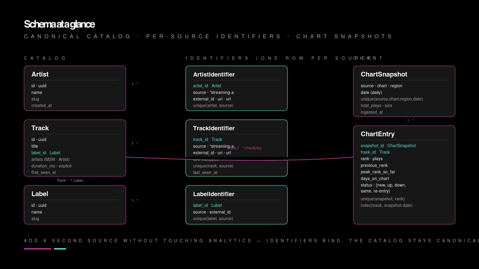
That split sounds obvious in a blog post. In practice it's the sort of decision that only pays off six months in, when a second source gets wired up and the only new code is a fetcher and a mapper from source identifier to canonical row. The analytics views, the aggregations, the exports — none of it moves.
The only piece of the schema that bit me later was the identifier table design itself. I started with one ExternalIdentifier table and a type column. Within a month I'd split it per-entity because the query ergonomics were painful enough that selecting a track's identifiers kept looking like .filter(entity_type="track") everywhere. Three narrow tables beat one wide one.
ETL without a job queue
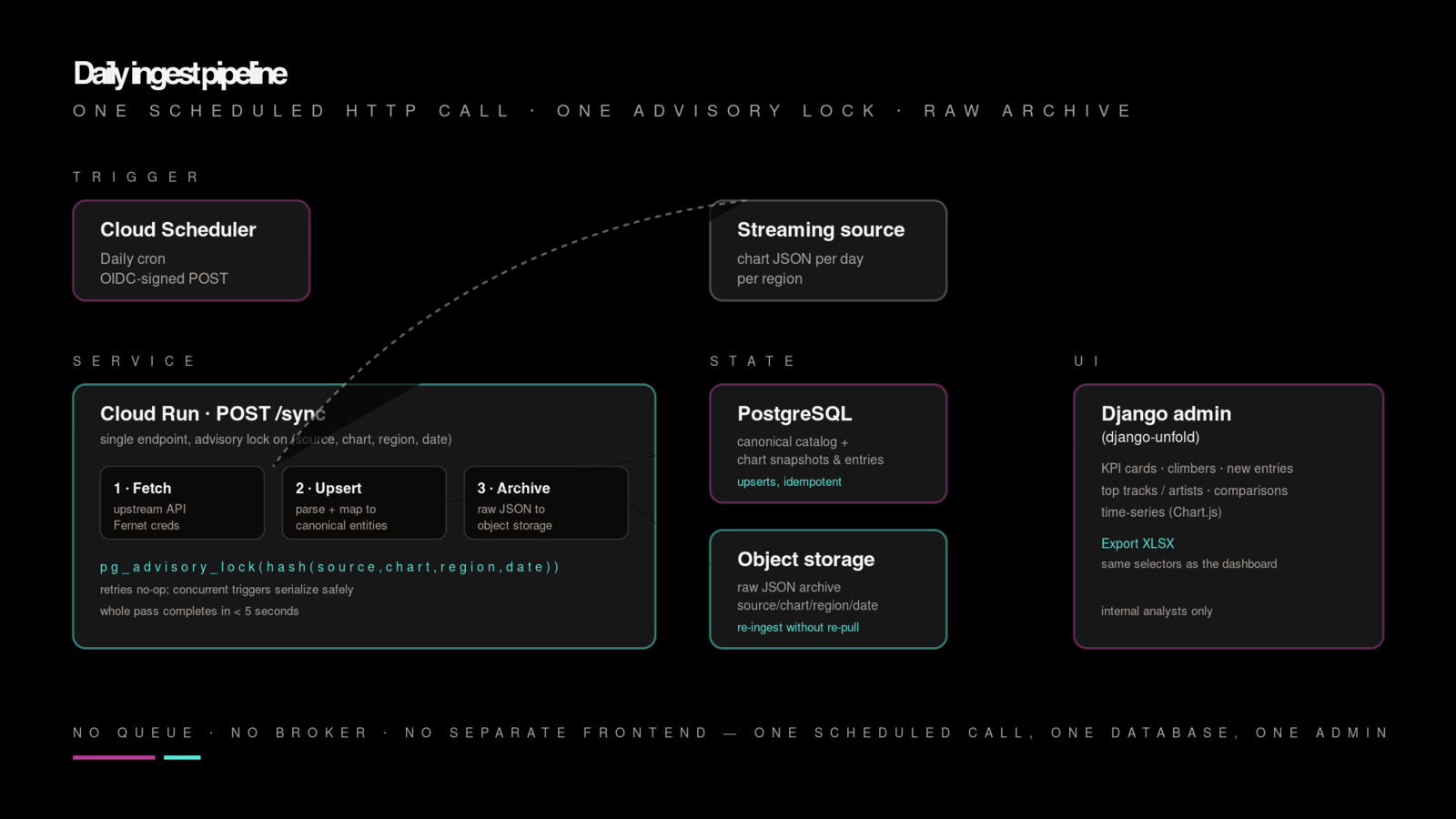
The job to be done here is a daily fetch, a parse, an upsert and an archive. The whole pipeline runs in a few seconds. That's it. There's no fan-out, no retry graph, no backfill that can't be a for loop in a management command. I kept wanting to reach for Airflow because Airflow is the thing you reach for; every time I asked what Airflow would actually buy me, the answer was "a UI, a scheduler, and a lot of operational surface." The platform was going to run on Cloud Run with a single instance, in front of a small Postgres database, with one person on call. The Airflow would have been bigger than the job it was running.
So the pipeline is a single endpoint:
# apps/charts/views.py
class SyncChartView(APIView):
    permission_classes = [IsCloudSchedulerOrStaff]

    def post(self, request):
        source = request.data["source"]      # "streaming-a", "streaming-b"
        chart = request.data["chart"]        # "top_track"
        region = request.data["region"]      # "regional-xx"
        date = request.data.get("date")      # defaults to yesterday

        with advisory_lock(f"sync:{source}:{chart}:{region}:{date}"):
            raw = fetchers.fetch(source, chart, region, date)
            services.ingest(source, chart, region, date, raw)
            services.archive_to_gcs(source, chart, region, date, raw)

        return Response({"status": "ok"})
Three pieces matter here, and none of them is novel.
The advisory lock. Postgres advisory locks are the quiet workhorse of this kind of system. If Cloud Scheduler fires twice because of a retry, or an analyst manually triggers a sync for a date the scheduler is already pulling, the second request blocks until the first one finishes and then no-ops because the data is already there. No ad-hoc "is this already running?" column on a sync table, no Redis dependency to add. One line of Postgres.
The fetcher is a stupid function. It takes a source, a chart identifier, a region and a date, and returns the raw JSON. Nothing else. Auth tokens are refreshed lazily — if the fetch returns a 401, the credential record on the way out is told to invalidate itself, and the next sync picks up a fresh token. Credentials themselves are kept encrypted at rest with Fernet, decrypted into memory for the duration of the call, and never written back to disk in cleartext. There is a browser-automation fallback for the case where the API changes shape; I shipped it as insurance and have used it once in production, which in hindsight means I didn't need it in month one.
Archive raw first, parse second. Every raw JSON blob goes into object storage keyed by source/chart/region/date.json before anything downstream touches it. If the ingest later turns out to have a bug — a field I misread, a field they added — I can re-ingest from the raw archive without re-pulling. The storage cost is trivial; the optionality is enormous. If I were starting again I'd skip the local JSON cache I built on top of this and go straight to the archive — the local cache was a convenience for the first week that then sat there as a redundant layer forever.
Cloud Scheduler calls the endpoint once a day with an OIDC-signed request. The IAM policy on the Cloud Run service only accepts calls from that specific service account, and the view's permission class double-checks. That's the entire automation story — one scheduled HTTP call, authenticated by a cloud-native identity.
Django admin as the whole analyst UI
The thing I was most prepared to be wrong about going in was skipping a dedicated frontend. I've built enough React dashboards to know how long "just a few charts" takes once you want date pickers, drill-ins, exports, auth and theming. The analysts here were going to be a small group inside the client's team. They wanted the data and the exports; they did not want to learn a new app.
Django admin — specifically, django-unfold on top of it — turned out to be more than enough. The overview page is a stack of KPI cards and a leaderboard panel, built by overriding the admin index template and feeding it from Django ORM aggregates. The analytics tabs are search, top tracks, top artists, and a comparison view, all live-filtered by date range and backed by regular Django views that render into the admin shell. Chart.js draws the time-series. The whole thing feels like a product because django-unfold carries the design, not because I spent sprint after sprint on it.
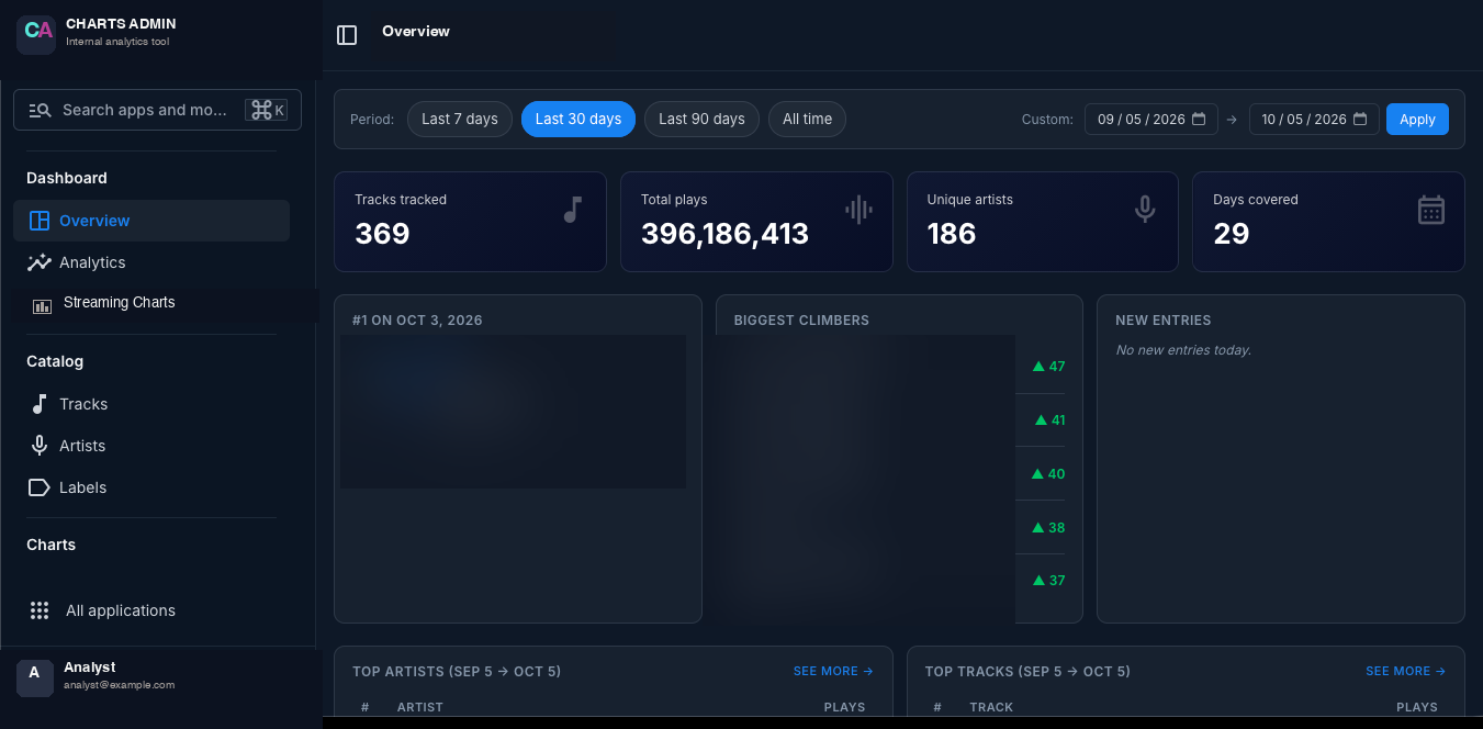
What I'd flag for anyone considering the same move: this works because the audience is a bounded group of internal users and the shapes of the questions are known. If the client had wanted public-facing dashboards or an interactive explorer for ten thousand concurrent users, I'd have reached for something else. For an internal analytics tool for a specific team, the admin is the right ceiling and django-unfold makes the floor look professional.
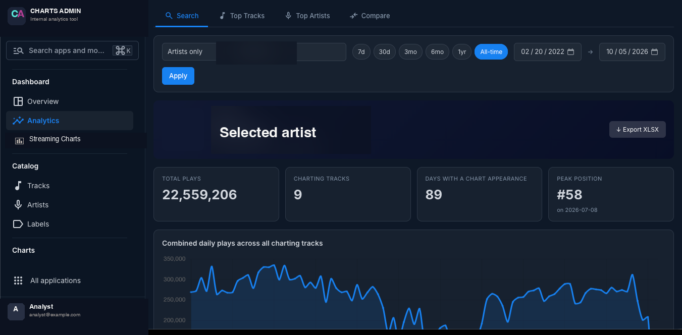
The bit I'm quietly fond of is the per-entity drill-in. An analyst searches for an artist, lands on a page that shows their lifetime plays, their chart tenure, their peak position and a daily plays line chart, and under all of that the full list of tracks that have ever charted for them. That page is one Django view and one HTML template. It took half a day. The equivalent in a React app would have been a sprint.
Exports that just work
The feature that actually made the platform load-bearing for the team wasn't the dashboard. It was the export button. The spreadsheet the analysts had been maintaining for years had a specific sixteen-column shape, and every downstream thing in their workflow — their weekly report, the slide they put in front of their artist managers, the deck for their label partners — assumed that shape. If the platform couldn't produce the same file, nothing changed for them. If it could, they stopped doing the dense-formula workbook and started pulling exports.
So every analytics view has an Export XLSX button in the top right. The button posts the current filter state to a view that composes the same aggregates the dashboard shows, pushes them through openpyxl into the sixteen-column template with the right header styling, and streams the file back. Rolling stats — peak position so far, days on chart, rank history as a sparkline — are computed server-side so the file lands in Excel without the analyst having to pivot.
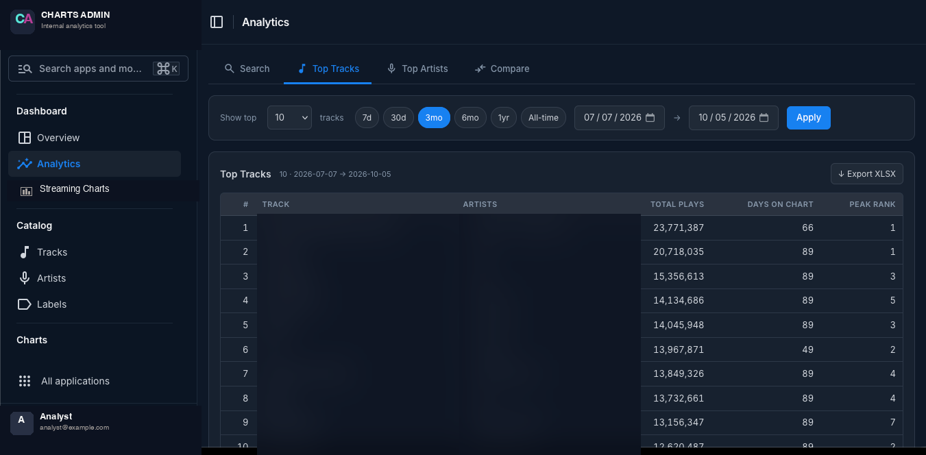
Two things made this feel finished rather than hacky. First, the exported stats are the same selectors that power the on-screen tables. There is one TrackMetricsSelector that knows how to roll up a track's history into a dict of stats, and both the admin view and the exporter call it. If the dashboard says a track peaked at #3, the spreadsheet says #3. There is no second code path.
Second, the exported row carries a per-track breakdown of its chart history, so the analyst doesn't have to flip back to the platform to see where it's been. The team was used to a workbook that showed everything at once; the platform's own UI shows one slice at a time; the export bridges the two.
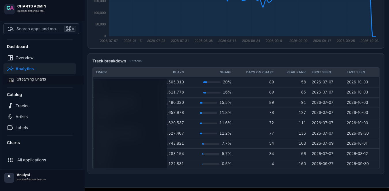
That last point is the design lesson I kept forgetting and then re-learning. An export isn't a smaller version of the dashboard. It's a different artifact, built for a different kind of reading. People who are going to look at the dashboard don't need the export; people who are going to live in a spreadsheet don't want the dashboard. Both are first-class.
What I'd do differently
A few honest ones.
The multi-source schema was the right call. Even with one source live for most of the first year, every analytics query I wrote was unaware of which source the data came from. When a second source is wired up, the ingest adds mappers; nothing else moves. That design decision has aged well and I'd make it the same way again.
The local JSON cache was overkill. I kept a filesystem cache of every raw JSON blob next to the fetcher, then archived the same blob to object storage. The cache paid for itself for the first few days when I was iterating on the parser. After that it sat on disk being a redundant copy. Next time I'd archive to GCS first, read from GCS when I need the raw payload, and skip the filesystem.
The browser-automation fallback was premature. I shipped it as a hedge against the upstream endpoint changing shape. The endpoint has been boringly stable. The fallback has one real invocation in production and a non-trivial maintenance surface (a headless browser, selectors that drift, a slow failure mode). Next time I'd ship without it and add it the first time the API actually breaks.
I'd push harder on the "one selector per metric" rule earlier. It took me a few weeks to notice that I was computing peak position in three places — once for the dashboard, once for the export, and once for the per-artist page — and they were quietly disagreeing on how to treat ties. One canonical selector per metric, and both the UI and the exporter call it. The disagreement goes away.
The underlying lesson for me on this project was that most of the engineering wins came from refusing to add layers. No queue. No separate frontend. No OLAP engine. A Postgres database, a Django admin, a scheduled HTTP call, an advisory lock, a raw-JSON archive, and a schema that didn't bake in the first vendor. That's it. For a small team with a specific job, that was more than enough — and it left me with the budget to spend my attention on the data model, which is where the real optionality for the next year of the platform lives.
- python
- django
- postgresql
- gcp
- cloud-run
- etl
- automation
- music
- analytics
- data-engineering